0 The Fed Effect


The markets have been influenced by a number of factors lately, so it is only fair to highlight a sizeable quantity of charts to explain. The transition from a central bank driven to an earnings driven market has commenced, and the performance has been uninspiring. Revenues have consistently come in weak, which can be expected in an environment as is seen today. Domestic GDP did not disappoint, but it is not at point that it can meaningfully diminish unemployment. Europe is still a mess, a more organized mess, but a mess nonetheless. The farther we move from the date of the QE3 announcement, the closer we come to the election and impending "Fiscal Cliff." Both of these events incite volatility and keep market advances to a minimum. The central bank "put" is still in effect, limiting downside, but with a lack of upside momentum, sideways movement looks to be the tone.
Below is a chart of commodities (DBC) over intermediate treasury notes (IEF). This indicator advanced and spiked leading up to the announcement of worldwide easing, but has since done nothing. It has broken its trend, and maintains sideways action. The inherent weakness is a sign that easing has capped our losses, but will not do enough to create sustainable belief and risk sentiment.
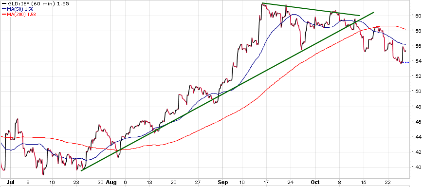
Sticking with the commodities theme, the next indicator is gold (GLD) over intermediate treasuries. Gold has traded in stride with risk assets lately, and this indicator has had an especially strong correlation. Gold showed consolidation after the Fed announcement, but failed to sustain strength upon reaching its apex. The indicator has trended lower as of late, and has broken major MA support lines. This weakness will weigh on markets and foreign currency appreciation for the time being.
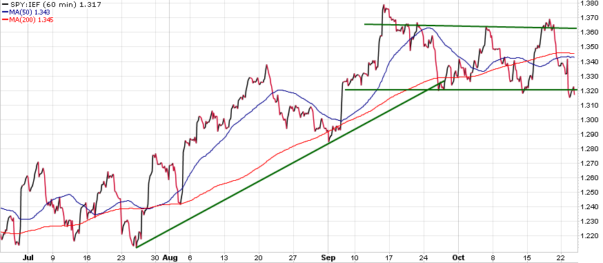
Turning to domestic equity, the capital flow between equity (SPY) and bonds is under the microscope. After peaking in mid September, this indicator has drifted sideways for a number of weeks now. It sits at its lower end currently, and will need to find a source of strength or prepare for broader pullbacks in equity and risk. The soft revenues are not helping, and misses by Apple (AAPL) and other heavy hitters have weighed markets down. Uncertainty should keep this indicator range bound and even deliver slight dips below its pattern.
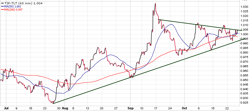
Another Fed indicator is seen in the bond markets. Inflation protected securities (TIP) and long term treasury bonds (TLT) paint a picture ofthe inflation expectation in markets. This indicator correlates nicely with risk assets and is quickly approaching its apex. It spiked in September, along with most risk assets, and now looks for a new direction over the following weeks. A sharp rise in either direction will have a strong influence on market sentiment and the direction of markets throughout Q4.
The last aspect of equity markets is the indicator of dividend funds(DVY) over broader equity markets. Capital usually flows to dividend paying stocks when market direction is uncertain and investors are choosing more defensive plays. This dividend fund has outperformed since QE3, and shows no sign of impending weakness. The strong negative correlation makes it a good indicator to track the VIX (VXX) as well. Volatility is expected with the upcoming election and "Fiscal Cliff," so do not be surprised to see this indicator stick to its trend.
Foreign markets play a large part in influencing asset movements as well, and maybe none bigger than the future of the Euro (FXE). The Euro has vastly outperformed US treasuries, which is a good indicator of capital flow between regions. The Euro being a risk trade has caught a consistent bid for a better part of three months. The indicator has reverted back towards its trend line recently with speculation around both Greece and Spanish outcomes, but there has not been a substantial break as of yet. Look for the movement of this indicator over the next few weeks to guide markets.
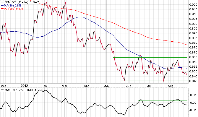
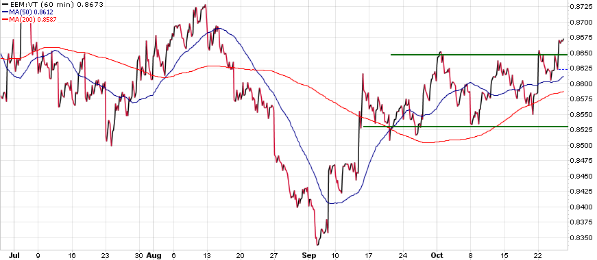
The last indicator is a testament to central bank easing over the past few months. Developed market equities have struggled in this post QE3 announcement world, but emerging market equity (EEM) looks to be outperforming world equities (VT). This indicator is primed for a breakout to the upside. This may not mean that all equities are set to spike due to renewed sentiment, but the amount of capital flow into emerging economies may fuel their respective equity appreciation over the following weeks. It is pertinent to have a clear tactical thesis when navigating in uncertain markets. Whether this be long or short positions, projecting where capital is going next means the difference between profits and losses.
0 Global Macro: Wait And See

September was heralded as the month of decision, and it is right to say that we are almost there, but not yet. Until decisions have been made, gauging the market requires using an internal scope to see how the intermarkets are playing out. The ECB congregates Thursday, and there seems to be some hope that, as limited as it may be, they will make some provisions. The semantics of short term lending and its legality have been thrown around, as well as the ambitions of an unlimited bond buying program. Whatever is to come from Europe is still unknown, but what we do know is that Germany will have its say in the matter.


The Federal Reserve is similarly in the process of triggering QE3 or not. Many believe that the next few weeks of economic data will play a deciding role in the decision, but that may be too rudimentary in thought. Considering stimulus will inevitably lead to price inflation, Bernanke may hold off on directly hitting the consumer. With the fragility of the Middle East and inflation seen in agriculture, the Fed may deem this an inappropriate time to weaken the dollar. The possibility of some other form of obscure easing could also be on the horizon.


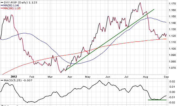
A theme seen throughout the latest rally was the demand of dividend paying instruments. With the seemingly yield-less government debt and fear of risk in particular assets, safer dividend plays were all the rage. The indicator below is that of a select dividend index (DVY) over an equal weighted market index (RSP). What is seen from the ratio is that dividends outperformed throughout most of the rally. This is a sign of defensive sentiment, but later on it saw a steep decline. That sense of waning risk aversion was fairly bullish, but the indicator looks to be consolidating. This is expected prior to market moving releases, similar to what we will be seeing shortly, and could mean pullbacks or further slothfulness from markets.

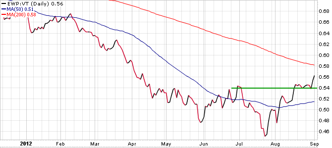
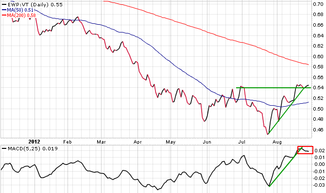
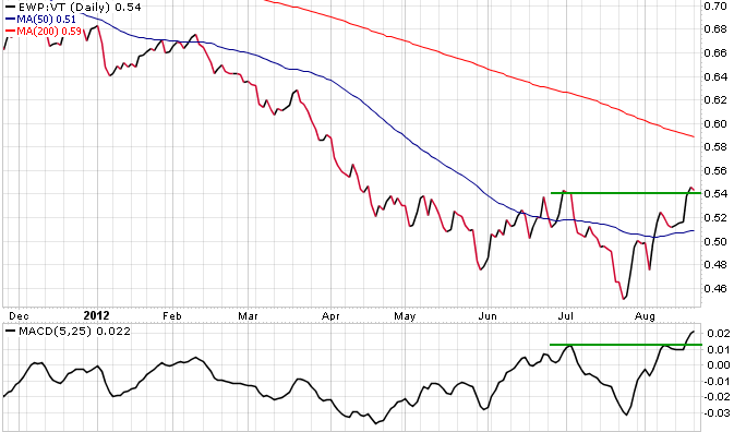
A fairly positive trend developing is Spanish equities leading world markets. Many of the decisions to be made by the ECB are due to deterioration of confidence in Spain. As confidence falls, their yields appreciate. The indicator below is that of Spanish equities (EWP) over world equity (VT). There has been a solid run up in the price action throughout the last half of the rally, and a slight consolidation as of late. The slight breakout seen below signals confidence that Spain may be better off than once thought. The duration of its current move relies directly on what the ECB decides in following weeks, but this indicator seems to be pointing towards relief in yields.

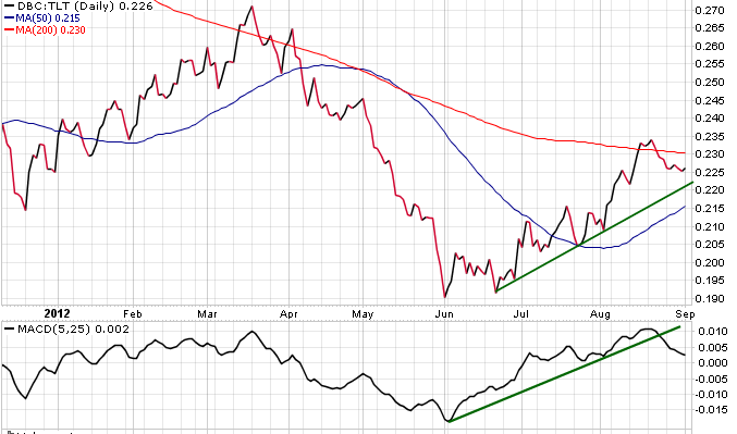
The last macro heavy indicator is that of commodities (DBC) over 20+ year treasuries (TLT). This indicator leads in a stimulatory/inflationary environment, the one in which most market participants hope to see shortly. Whether it is the ECB, Fed, or PBOC that pulls the trigger; this indicator will uptrend. As can be seen, there has been a slight recess in the action recently. Both the price action and MACD have pulled back, but this can be attributed to various factors. The main factor that is trying to be highlighted here, however, is that a risk on environment should trigger upward mobility. Another insight is that this indicator has some room to move lower without breaking any major trend lines. Look for this move lower in following days prior to decisive action.


Moving into the realm of a more equity centric point of view, we turn to a few obscure indicators. The first one is the S&P 500 number of issues above their 50 day MA over treasuries. This indicator shows the short term strength of equity markets. As can be seen below this indicator is fairly volatile and has recently receded off of its trend line. This is not to call for a pullback, rather to show that the upward strength is not currently present. Further developments should propel this indicator in a more definitive direction.

The longer term outlook is shown below in equities. This indicator is that of equities over their 200 day MA's compared to treasuries. This indicator is less volatile and looks to be slightly retracing. It showed strength towards the end of the last rally, but is pulling back before either moving higher, or regressing into the rectangle.


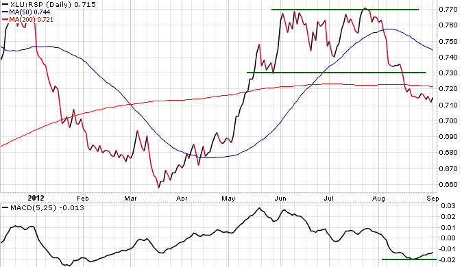
The last indicator is a volatility measure. When markets are volatile and VIX (VXX) is active, utility stocks (XLU) outperform the broader market. This indicator has seen a breakout lower, but is somewhat bottoming at its current levels. There could be a move back up to the rectangle or simply a sideways move. Whatever is the case, strength in this indicator indicates volatility in broader markets


The magnitude of charts is needed at current times, because there is a seemingly lack of headlines influencing markets. We are at a wait and see moment, and these indicators can confirm that.

0 Global Macro: The Bernanke Floor


Since the inception of Quantitative Easing, many have debated its diminishing returns quality. Although easing does manipulate true market action, this is not to say it harms it. Speculation surrounds what will happen when it is all said and done, but currently, QE has brought into existence a Bernanke Put of sorts. The Fed was initially created to aid in times of crisis, in order to limit its effects. With the macro picture as it stands, the Fed looks to provide liquidity and limit loss. Diminishing effects implies a lesser pop on announcement, but a pop is superior to a downturn. Markets turned higher today on dovish tones from the fed; which begs the question, do you prefer capital preservation to margin calls? Gradual growth has been expected, but high unemployment for too long leads to structural damage. This damage could lead to far reaching issues, and could even be magnified with a weaker global picture. The Fed realizes this, and says it stands ready.
As evidence to the fact that a Bernanke Put improves market confidence, consumer sentiment rose to its highest level since May. Although uncertainty has littered the air, the belief in a floor of future despair kept sentiment high. As long as hope remains in markets, sell offs should not be overly drastic. Bernanke controls what he can, but Draghi and Germany have issues in their own right. Further announcements should keep markets on their toes for the better part of September.
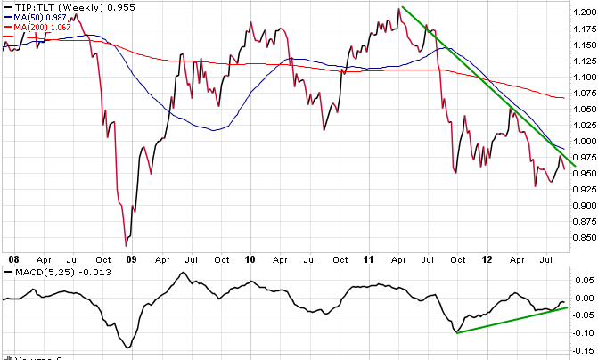
The first quantitative chart to be discussed is inflation protected treasuries (TIP) vs. 20+ year treasuries (TLT). This ratio gives room to the idea of more easing. As inflation and economic growth expectations diminish, the indicator falls. It correlates strongly with risk assets, but has shown price weakness lately. This indicator usually bottoms prior to QE announcements, but as of late, it has kept falling. It is not to say we are as bad off as in 2008, but the Fed was right in its remarks. Growth is between the realm of gradual and anemic, which will further dampen outlooks unless corrected.
Along the same lines, commodities prove to be an indicator of global market health. The ratio of commodities (DBC) over treasuries shows the markets are reverting towards lower trend lines. It broke out higher in mid June and has led throughout the current rally. However, the macro picture still has many questions to be answered, and until they are, commodities won't continue to lead. The MACD tracking this indicator has broken lower, but sees resistance at the zero level. The solutions to be unturned in the near future will determine its direction.
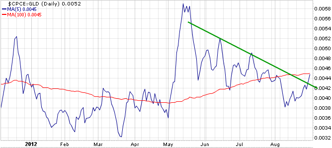
In order to see things that the market doesn't, it sometimes requires obscure methods. In this case the obscure indicator is Put/Call Equity indicator over gold (GLD). Put/Call moves inverse to equity markets and gold moves purely on supply/demand. As calls are accumulated, bullish sentiment rises. However, to put this single aspect to the test, one can add another leg. Gold acts as a weight of sorts, and when calls or puts are being accumulated with vigor, the indicator will show it. The weight adds to the already strong inverse correlation, and as can be seen, there is some upward break. This is bad for risk assets, including equities. It will need to continue lower for sentiment to remain intact.
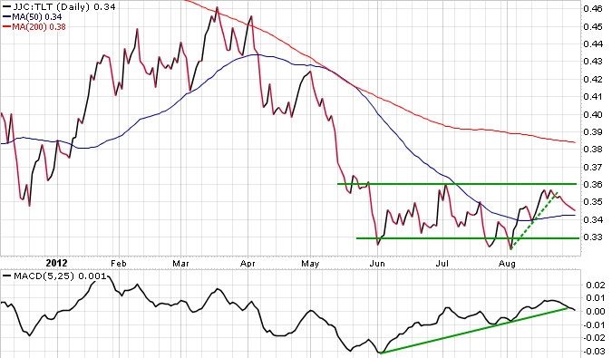
The last price ratio contains copper. Copper is said to be a solid indicator of economic outlook and this indicator confirms it. Copper (JJC) over treasuries correlates around .93 with equity. It has been range bound for much of the current risk rally, but looks to be showing weakness now. The break of both its price action and MACD underlying indicator are bearish for copper and risk as a whole. The fundamentals driving the move are weakness and lack of clarity out of China, as well as a struggling Aussie Dollar/Asian equity. The fed announcement should aid its move, but economic strength is the real catalyst.
Overall markets have a perceived put in place. This is due to the belief that Bernanke and Draghi stand ready for action. The only downside is if a macro situation unfolds that compromises their ability. If they begin to look overwhelmed at any point, then markets will break lower with force.

0 Global Macro: A Volatile Environment

The Macro outlook is currently littered with uncertainty, yet it contains a hint of predictability too. The decisions to be made over the next month are primarily concerned with political action. Bernanke meets in Jackson Hole on Friday, and there is the belief that he may reveal his hand. The ECB meets throughout September, but the date on which a solution will be presented has less clarity. Along the same line, there is an idea that China may intervene to compensate for the East's recent string of bad data. All events are known to be pending, but their outcomes are unknown.
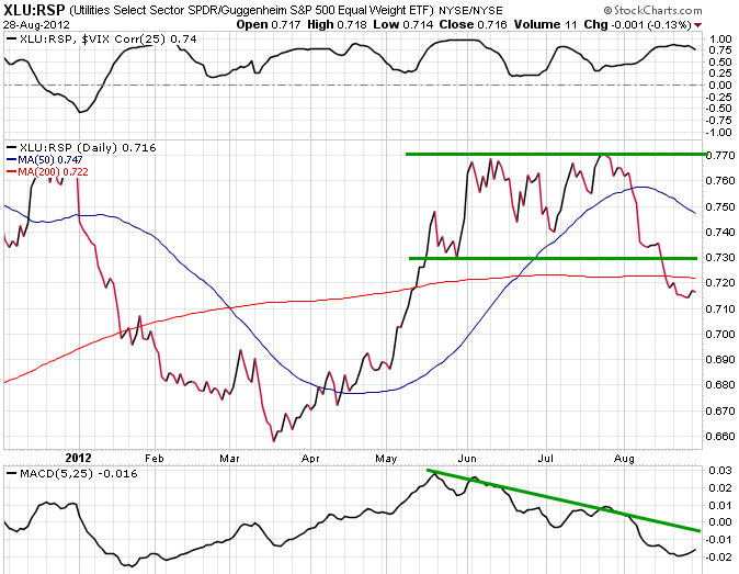
With the overhang of uncertainty, the call for volatility is valid. The VIX (VXX) has been silent as of late, but a swift return remains. An indicator that highly correlates with VIX is utility stocks (XLU) over equity markets (RSP). It and VIX trade near a .75 correlation, yet their charts vary. What is clear in the image below is that the ratio looks ready for a pullback. Its MACD is fairly below the downtrend line and the price action in general looks to be rounding back. This could foretell the coming weeks of announcements, and a move lower in equities.
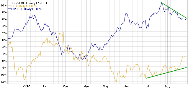
The next look is gold (GLD) over the Yen/Euro cross (FXY)(FXE). The Yen/Euro is another asset that has been trading alongside volatility recently. By comparing its move to inflation linked gold, one can measure market sentiment toward riskier assets. Gold has gotten a footing, but fear must sufficiently leave the markets for the yen to experience selling pressure. If both assets can sustain their respective trends, then risk should avoid a drastic sell off.

Spanish equities have similarly been in the spotlight recently, and their future direction speaks volumes for the markets as a whole. Spain equities (EWP) over world equities (VT) is the indicator below, and it shows a compelling story. With the paradox being that the ECB won't initiate bond buying until Spain agrees to their measures and the other way around, Spanish equities are at a standstill till a decision is made. Spain has been leading as of late, with a steep slope, the indicator is primed for consolidation. Within the broader framework of the chart, the price action's next move has strong implications. If it continues higher with vigor, the chart has bottomed; but if it bounces off resistance, the downtrend becomes stronger. The next few weeks should give a sense of direction to this sideways indicator.

With the various indicators above each telling a story of their own, they all inherently reflect a bigger picture. The markets have been moving on an idea, but this idea has yet to manifest itself. If one is to believe that we have priced in easing, then lack thereof should ignite selling. The money that now resides in the market is playing a guessing game with central banks. In other words, their premises are pure speculation.

0 Global Macro: The Macro Trade Requires Eyes On All Markets


The macro trade currently requires a three pronged approach. The only way to navigate is to keep a keen eye on US, China, and European revelations. Markets spiked on the idea that the Fed could stimulate, but backed off when they questioned its probability. The biggest wrench in the easing debate currently, is whether economic data has improved enough to not warrant it. However, the minutes were clear, enough so to diminish much of the perceived vagueness. There was a call for substantial and sustainable economic data growth in order for the Fed to back off further easing measures. The data to date has been sporadic, and looking at indicators on a moving average basis, you will be hard pressed to find a clear upward trend.
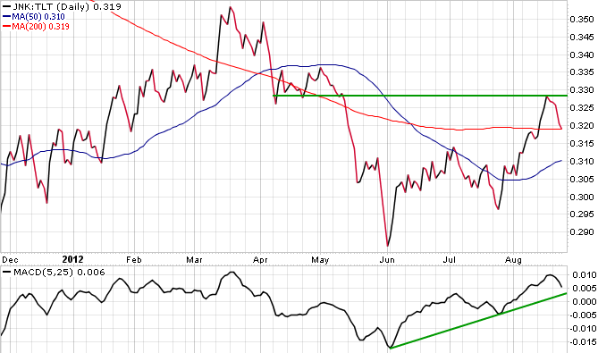
The first chart is that of junk debt (JNK) vs. 20+ year treasury (TLT), this indicator correlates well with the risk on markets. The ratio hit a wall of resistance, and with lack of substantial and positive evidence, it receded lower. Junk was yielding record low rates, and the run up even had Pimco cutting its exposure to the field. There is certainly room for a move higher, but this looks to correlate with further news to catalyze markets upward.
The next ratio of importance is European financials (EUFN) vs. the global equity market (VT). With so much hanging around the dealings of Europe, in both its Sovereign and Corporate debt markets, this indicator has a lot of sway. There looks to be improvement in the leadership, and meaningful plans seem to be in the works. The indicator must outperform in order for global confidence to regain its footing. The ability of both peripheries and core countries to decide on realistic plans, flexible and pragmatic, will lead to improved sentiment around the region. Sentiment has driven European yields, and cohesion amongst the group will only lead to more advance. The indicator looks to have reached resistance until further progress is made. Look for action in September to greatly influence its move higher, or lower.
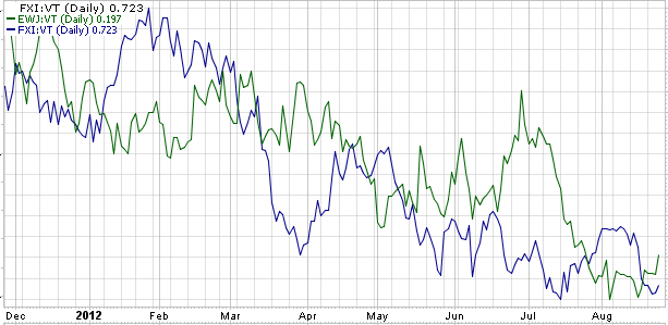
A move to the Far East presents a gloomier appeal. The indicators of choice are China (FXI) vs. world equity and Japan (EWJ) vs. world equity. Both markets have vastly underperformed over the past nine months. The shrinkage of exports in both is a concern, and can be attributed to a weaker global economy. Japan's drastic currency appreciation has done nothing to help its cause. Weak equity environments highlight each regions economic issues, and signal the need for relief. A move from the PBOC could moderate such declines, and would be positive for risk across the board.
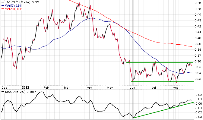
An externality from a stronger Asia would be stronger commodities. The indicator in question is that of Copper (JJC) vs. 20+ year treasuries. This indicator shows strength in the face of inflation, and some form of easing out of China will prop it up. Risk on markets, as a whole, have moved on the notion that someone in the developed world would make a move to stabilize their economy, and copper has similarly oscillated alongside the idea. A move by at least one of the central banks should traject copper upwards, and out of its range.
Keeping this premise in mind, another market to watch is emerging equities. Emerging equity (EEM) vs. the world equity market, has a vested interest in China and the global economy as a whole. This indicator has been somewhat breaking down lately, and must show strength for confidence to return to the macro economy. The ratio's MACD indicator has been oscillating between bull and bear territory for months, and looks to make a move on more tangible evidence out of the developed world. Its hand being in commodities and exports as a whole, requires a stronger environment of operation. Until that environment is produced, this indicator will show weakness.
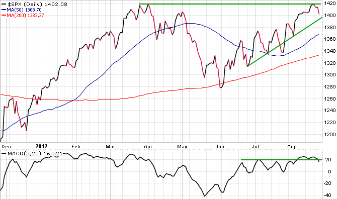
The last chart is that of the S&P 500 (SPY). Many people believe that the expectation of QE has led to the pricing in of its move in totality. Basically, that the market has run its course. The volumes have been low, but this was expected until tangible evidence was produced. Along the same thought, no meaningful breakout should be conceded until more evidence is shown. Based on the indicators above, equities do look to have more room, considering much of its suppression has been derived from the aforementioned problems. If problems are meaningfully fixed, why shouldn't risk breakout to new highs?

0 Global Macro: The World Awaits Stimulus And Deals With Uncertainty


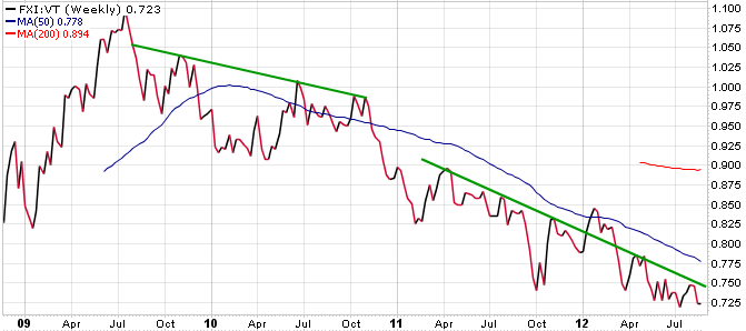
Although speculation and waiting are still the name of the game in both Europe and the U.S., China is feeling the pain now. Its exports have weakened and its equity markets are in decline. The chart below shows Chinese equities (FXI) underperforming World Indexes (VT) for upwards of three years. This indicator has seen great resistance for years due to the perceived risk of Chinese equities, as well as the fear of a hard landing for its broader economy.
With lowered inflation and the fear of what global weakness could bring, look for China to turn toward easing soon. The country has been quick on the trigger over the past few years. Whether in the form of interest ratecuts, a cut of the reserve ratio, or stimulus in the form of spending, expansionary moves look to aid assets with a vested interest.
Click to enlarge images.
Copper looks to find a bid in this instance, but the Aussie dollar (FXA) vs. yen (FXY) trade could work as well. This pair has been on the rise for months, but overhead resistance is evident. The MACD indicator has narrowed to potential breakout proportions. Given the weakness of Chinese equities and the point of resistance in the Aussie/yen, impending stimulus measures could again give the needed boost to assets with vested interests in China.
On the bond front, the spread between the Treasury short-dated bills (BIL) and the long-dated bonds (TLT) has reached a short-term tipping point. Room for an upward move is possible, but in the short term a pullback looks probable. The waiting game continues in financial markets, and treasuries as a whole are oversold. A tightening of the spread, due to consolidation/pullback, is an obvious move in the near future.
Turning to the bearish indicator, utility stocks (XLU) have failed to meaningfully break lower vs. the broader market of late. The ratio has been in a general decline, but a convicted break lower would lend strong support to an equities rally. Although a defensive rally is a rally nonetheless, real belief in the economy means less risk aversion.
Although European officials have come out and shown consistent support for the euro project over the past few weeks, markets remain on edge about a solution. Treating an insolvency problem as a liquidity problem is one thing, but refusing to treat the problem is quite different. Spanish (EWP) and Italian (EWI) equities vs. the world market index have each, respectively, had a nice run recently. But more conviction is needed to bring it over the top. Much like the other indicators in this article, Italy and Spain have reached upward resistance. Both of these indicators correlate strongly to U.S. equity markets, and a resolution to their problems is essential in prolonging a bull market.
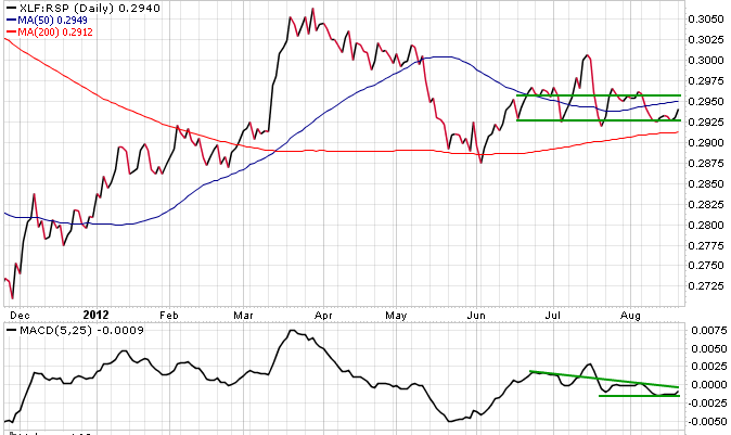
The last indicator of importance is U.S. financials (XLF) vs. S&P 500 equal weight index (RSP). This ratio has entered into an extreme consolidation the past few months. Both the price action and MACD indicator are oscillating within a very narrow range. The waiting game among various global factors -- ECB, Fed, and China -- have led to financials sitting tight. A decisive move within the macro picture should provide this ratio some direction.

0 Freeport-McMoRan Looks Toward Chinese Stimulus


A few days ago I appeared on the George Jarkesy show and recommended his listeners take a look at Freeport-McMoRan Copper and Gold Inc. (FCX). I intend for this article to be the look they were hoping for. This company trades at the will of its macro environment, thus calling for a macro picture to be painted. Uncertainty has littered the markets recently, so to say I write this article with a long term approach in mind is unfair. I do believe in the impending strength of the company, but a swift exit/profit taking is similarly advised.
The first chart below shows the strength of Chinese Equities vs. the Vanguard World equity index . Strength is a loose term, considering there hasn't been much of it over the past four years. Overall fear of Chinese equity market credibility, as well as the fear of a hard landing, has suppressed much of its strength. However, nearing long term lows, this indicator points toward the need for more stimulus. China has had a quick stimulus trigger recently, so to say more is on the way is not out of the question. Upon doing this, certain assets will catch a bid. Commodities is an area that looks to benefit.
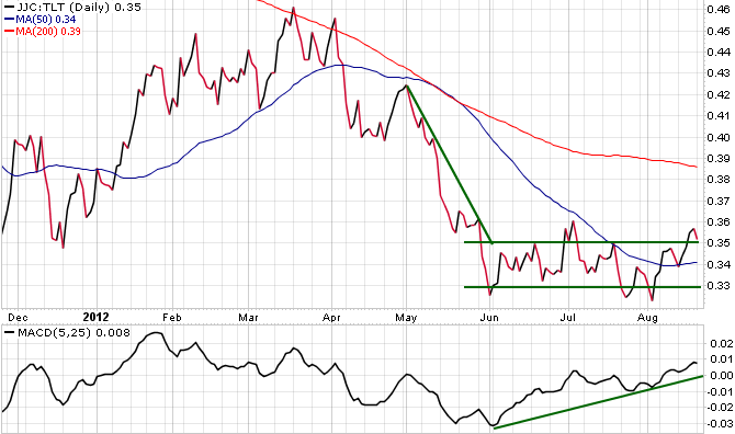
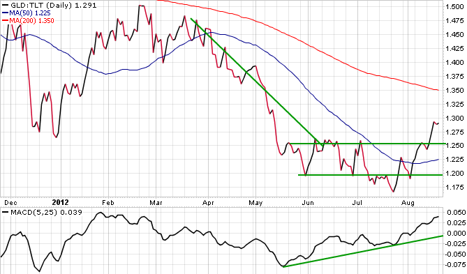
Among the commodity realm, copper and gold have a lot to gain from this decision. The charts below highlight both commodities - inflationary - versus the anti-inflationary 20+ year treasury index. With copper being of major importance to physical growth in China and gold being an overall inflation hedge, both could break out in the near future. They are both in multi-month consolidations, essentially waiting for the macro picture to make its move. Stimulus from China, ECB or the Fed could ignite either ratio higher.
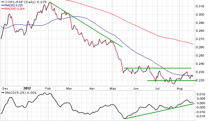
A look into the equity market confirms the current argument. The copper miners equity index has also consolidated versus broader equity markets as well. The MACD oscillator has shown strength over the past few months, and looks to enter bull territory. If the picture plays out as expected, then a break higher is similarly anticipated.
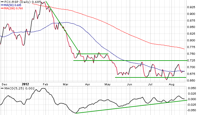
In order to gain exposure to this move, a look into Freeport is a goodbet. Freeport has a lot of exposure to both copper and gold prices, mostly copper. They are weighted about 70% copper mining vs. 30% gold. With the high correlation between copper, China and Freeport, it has obvious trade potential. Again looking into ratios as a good indicator, FCX is on the cusp of bottoming out and potentially leading vs. equity markets . This makes it an overweight candidate, and along with the fundamental picture, gains are a possibility.
Lastly, and without a ratio, we look at FCX alone. Much like the charts above, a consolidation has been present over the past few months. A false break higher occurred over the past few weeks, but more is needed for a legitimate push higher. The move is to buy in near the 35 support zone and set a stop somewhere near the middle of the consolidation pattern. This will limit the losses, yet give potential for a move higher in an inflationary environment. Hope this article was clear, and good luck.

0 Weekend Global Macro: Resistance Approaches Macro Risk Assets


The current rally has been questioned on its validity for weeks now, but the internal indicators have been telling a different story. The gradual decline of the VIX (VXX) has done the opposite of diminish fear in the market. At its current levels, many traders have begun to speculate that a potential deep cliff is possible in equities. This trade is improbable due to the existence of ready central banks. September looks to be the month that reveals the true nature of foreshadowed stimulus. A major drop is likely to stimulate immediate action, most likely in China. They have been quick to the trigger on easing policy lately, and with a low CPI, they look to be up for more stimulus soon. The indicators that are presented in this article correlate nicely with the VIX, and show potential for a strong market rally in the future.
The first indicator above is that of the volume for the S&P 500 (SPY) over the past nine months, along with a 50 day moving average. The low volumes are evident, and with such strong moves on low volumes, the markets remain skeptical. This is expected, but the path of least resistance looks to be up for now. As long as there aren't any negative catalysts in the near future, the markets should continue a melt up.
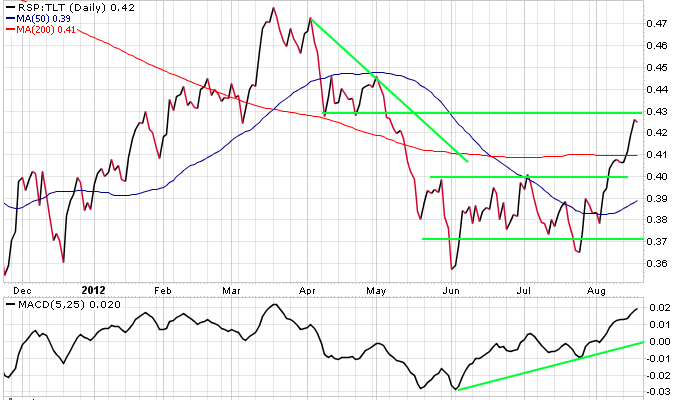
The markets (RSP) have outperformed 20+ year treasuries (TLT) recently, which is a bullish indicator. The outbreak came in early August and has confirmed equities move as of late. The problem is that we are gradually approaching September, and no hard news has been presented yet. The upward resistance looks to be a suppressor over the next fewtrading weeks, which could limit equity gains till decision day.
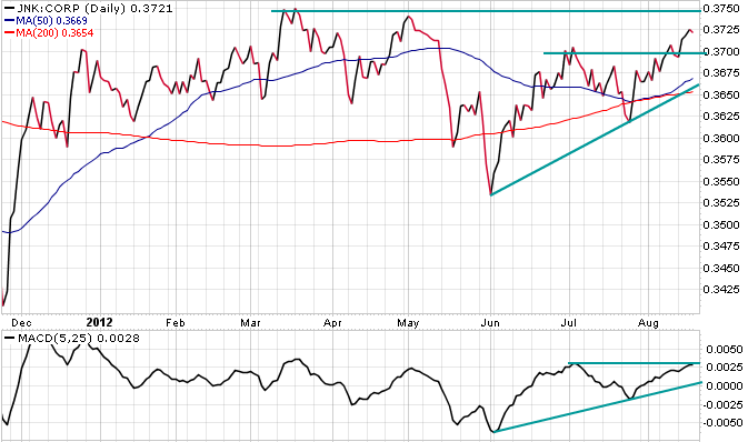
The next chart is that of Junk Corporate Debt (JNK) versus Corporate Investment Grade (CORP) . Although both should outperform treasuries in a bull market, junk should outperform all in a truly strong economy. The high positive correlation between this ratio and the move of equities is a testament to its validity. Like earlier indicators, this ratio has been appreciating over the past few months. There looks to be some upside until the point of resistance, but expect for a drastic move, either higher or lower, to come in September.
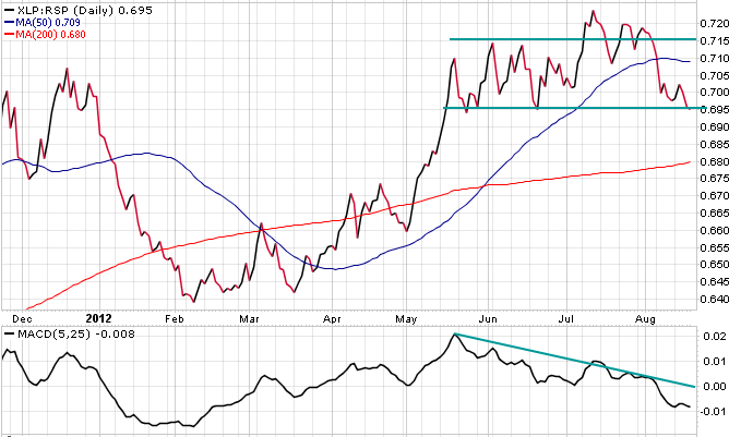
The two charts above represent Utility (XLU) and Consumer Staples (XLP) stocks versus the broader market. Both of these indicators should show weakness in a strong rally. The fact that both indicators have, and are still on the cusp of a downward breakout is positive for risk assets. With more definitive news, look for both to show convicted breakouts lower.
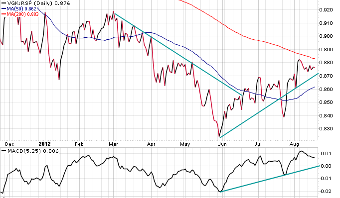
Angela Merkel reaffirmed Germany's commitment to the Euro on Thursday, which led to further equity rallying. European equity (VGK) has outperformed our market recently which correlates to a move higher in risk assets. With so much tied into the situation with the Euro, any form of strength out of the European Union looks strong for global assets as a whole. This indicator is fast approaching resistance, and further strength in this ratio should correlate with action from European officials.
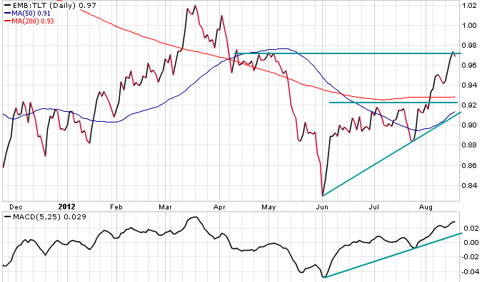
A more obscure variable, but nonetheless important ratio is that of Emerging Market Debt (EMB) versus US 20+ year Treasuries . As is expected, this ratio has outperformed with other risk assets. Emerging market debt requires the perception of a strong global environment, due to their many exports. With emerging markets recently hitting a wall, look for this indicator to move along with the global picture of further easing, or lack thereof.
As a whole, financial markets do show some semblance of strength. Speculators may be calling for depreciation from the current levels, but the market internals signal that higher moves are capable. All moves are tied to decisions to be made in the future, but a drift higher is likely, especially on the limited volumes seen as of late.
 

MACRO DOWN Copyright © 2011 - |- Template created by O Pregador - |- Powered by Blogger Templates